Johns Hopkins University- American Selfie Exhibit
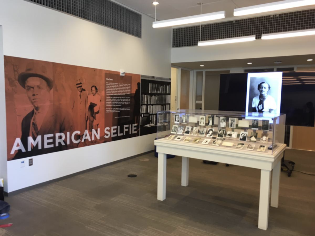
Johns Hopkins University contacted us regarding this upcoming exhibit with a need for wall graphics to accompany their small case and monitor display. This exhibit was to be located in the commons area of the library. It was important that this design did not take away from the main focus of the postacrds and also that it fit within their budget. They wanted to also include an interactive element, backdrops that encouraged students to take their own selfies.
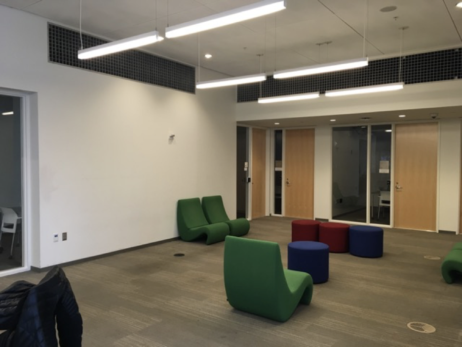
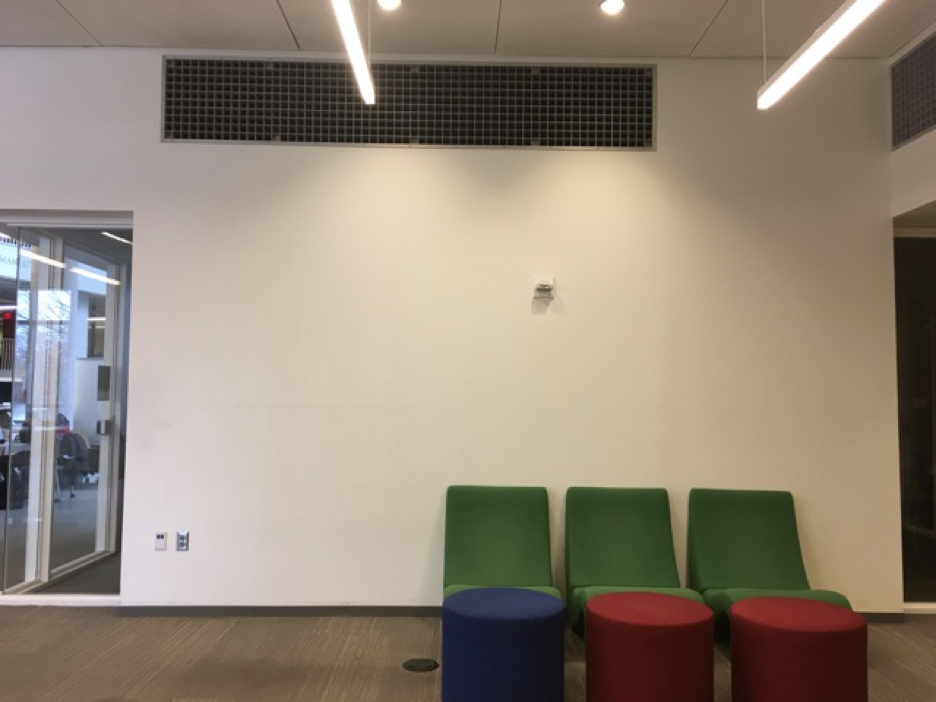
My first step in any exhibit or environmental design is to visit the space. Understanding the size and space of the design area is only one piece of the puzzle. I also take the time to observe the use of the space and the colors and textures of the surrounding areas. The libraray is a very large space and includes many different elements. The design’s space was mostly white walls and glass, however the surrounding areas also included one green and one blue accent wall. All of these elements need to be taken into consideration for balance within the space. Good design compliments the space it does not overpower it.
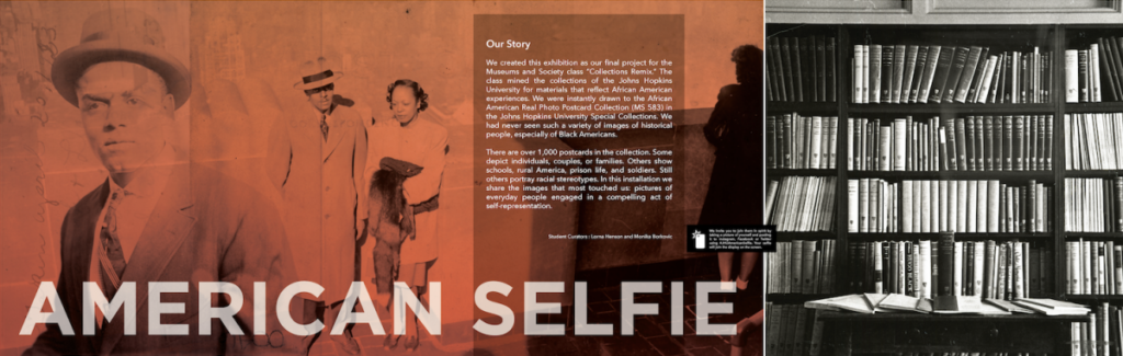
Now that I had a good understanding of the space I could study the content for the exhibit and understand the best way to present the information. This exhibit was very interesting. Initially created by students at the University it focused on the African American Real Postcard Collection which was part of the University’s Special Collections. They provided me with all of the text content they wanted included as well as access to all of the postcards in the collection.
At this point I needed to consider their budget and what materials would work best in the space. There were so many options to consider here; 2 small text panels that would have hung on the wall or the text could have been cut from vinyl and installed directly onto the walls. After seeing the space I felt that these options would not have the impact for the area. This space needed a lot of color to complete with the rest of the library. Wall murals were chosen to create an environment that enveloped the space. Wall murals can be expensive but covering the entire wall is not always necessary. This can help cut down on the cost.
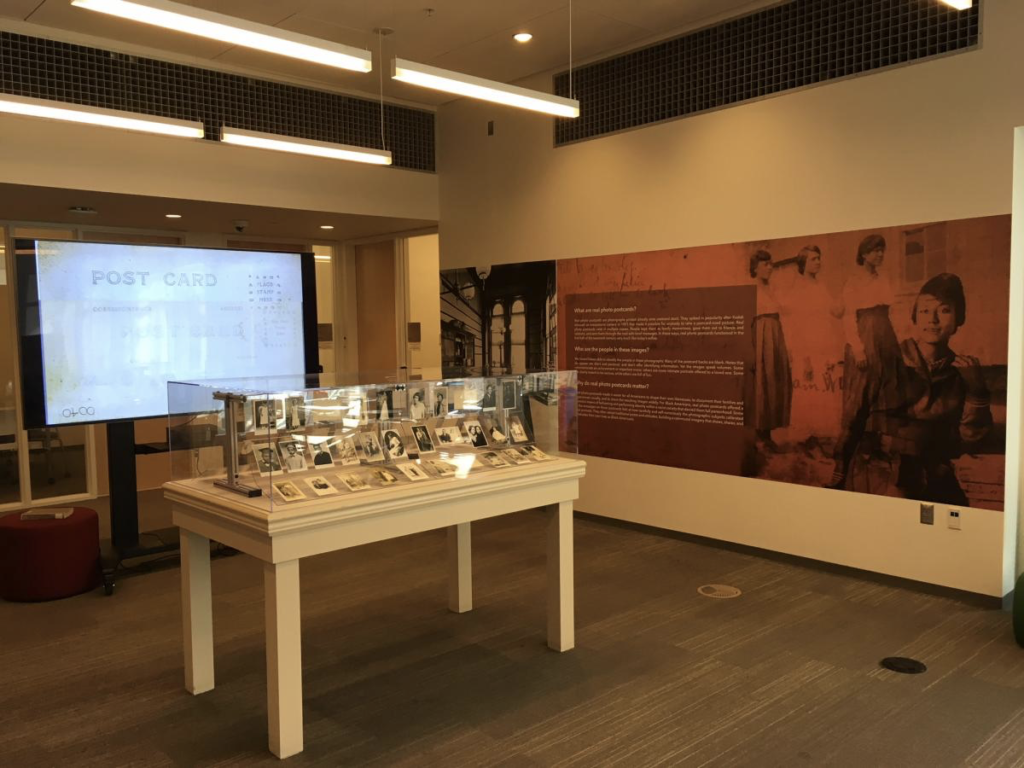
So at this point I had the idea of the space and what it needed, the content and how it needed to be presented, as well as the materials that would be used for the display. Now I could finally open illustrator and get to work on the actual design. I created artboards for both walls within the same file. Doing this helps to see all of the design together to make sure they fit together properly. Now onto colors. I started thinking about the 2 accent walls and furniture in the space. I wanted something that would stand out but not be overbearing. You also have to consider that people will be reading text within the design. This is why I chose this tone of orange. It compliments the other colors in the space but also invites your attention. It is also not aggressive on the eyes while staring at it to read text.
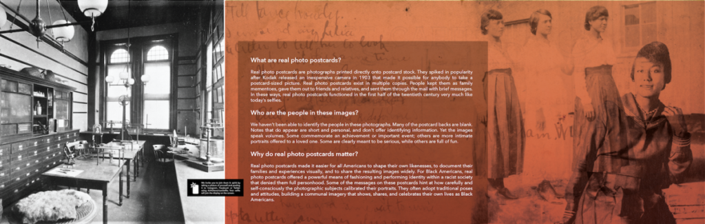
This exhibit was about photography. Solid color panels with text just didn’t seem to fit it’s purpose. Also as postcards are small in nature the design needed the photographic elements to introduce the exhibit to someone on the other side of the library. I viewed the entire collection of postcards looking for images that had visual interest as well as the attributes needed to properly layer them. SInce they are not just photographs but also post cards, the letters on the reverse sides were also layered to fully introduce the exhibit visually. Vintage images were included in the wall murals as the backdrops for students to take their own selfies and join the exhibit. This was explained in a “quick tip” fashion.